


Hands on with Surface 2 and Surface Pro 2: Second verse, same as the first

When creating the Surface 2 and Surface Pro 2, Microsoft's ambition was not to reinvent the device but simply to make it better. The company is committed to the basic Surface concept of a tablet with a kickstand and detachable keyboard, and the second generation devices do nothing to shake up that formula. Like before, the goal is to make tablets that are highly productive.
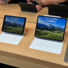
Aesthetically, the devices look extremely similar to their predecessors. On the Pro version, the only obvious change is the logo on the back. Where before there was a Windows logo, there's now a Surface logo.
The ARM version (which no longer sports the "RT" moniker; it's simply known as Surface 2) has this logo too, but it also has a more obvious visual change: it's now grey. Instead of the black finish of the first generation devices (and still found on the Surface Pro 2), it's a bare metal device. The front is black glass, but all the other parts are metal grey. There won't be a black option either.